
How to Create a Glowing Button Animation with CSS
Buttons are a crucial element in web design, and adding a glowing effect can make them stand out. In this tutorial, I’ll show you how to create a glowing button animation using pure CSS. By the end of this post, you’ll be able to create your own glowing buttons with ease. I've included a code snippet, a snapshot, and a demo video to help you follow along.
Final Out:
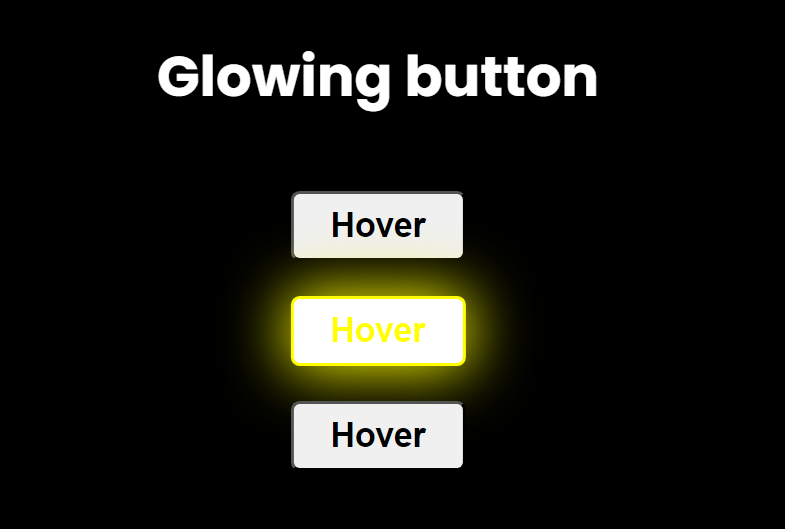
Glimps
Code Explanation:
index.html

style.css


index.html
<!DOCTYPE html>
<html lang="en">
<head>
<meta charset="UTF-8" />
<meta name="viewport" content="width=device-width, initial-scale=1.0" />
<title>CSS Animation</title>
<link rel="stylesheet" href="style.css" />
</head>
<body>
<div class="container">
<h1>Glowing button</h1>
<div class="buttons">
<button id="one">Hover</button>
<button id="two">Hover</button>
<button id="three">Hover</button>
</div>
</div>
</body>
</html>
Style.css
body {
background-color: black;
font-family: poppins;
}
h1 {
color: white;
}
.container {
display: flex;
flex-direction: column;
align-items: center;
position: absolute;
transform: translateX(-50%);
left: 50%;
}
button {
cursor: pointer;
display: block;
margin: 20px;
width: 100px;
height: 40px;
font-size: larger;
font-weight: bold;
border-radius: 5px;
}
#one:hover {
box-shadow: 0px 0px 35px 2px blue;
background-color: white;
color: blue;
border: 2px solid blue;
}
#two:hover {
box-shadow: 0px 0px 35px 2px yellow;
background-color: white;
color: yellow;
border: 2px solid yellow;
}
#three:hover {
box-shadow: 0px 0px 35px 2px green;
background-color: white;
color: green;
border: 2px solid green;
}

No comments:
Post a Comment